Adult Time In Color is a new monthly blog entry that will focus on the art behind famous episodes, series and movies in our library!
Estimated Reading Time: 2 minutes
This month we are looking at Perspective which was released in September 2019.
You Don’t Know What You Have… Until You Lose It…
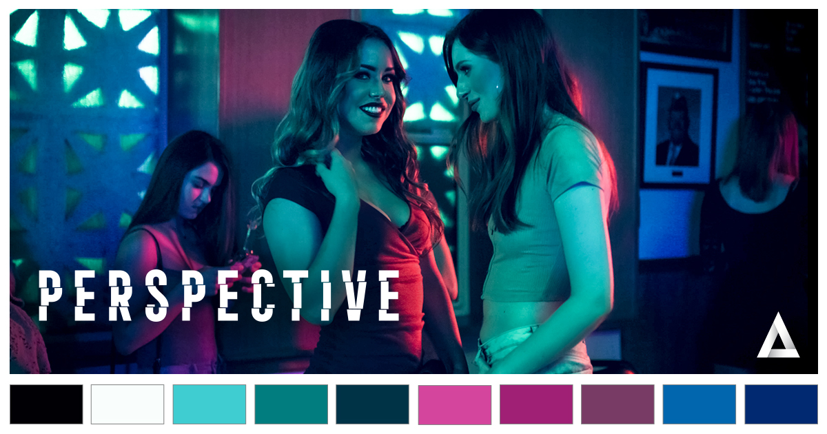
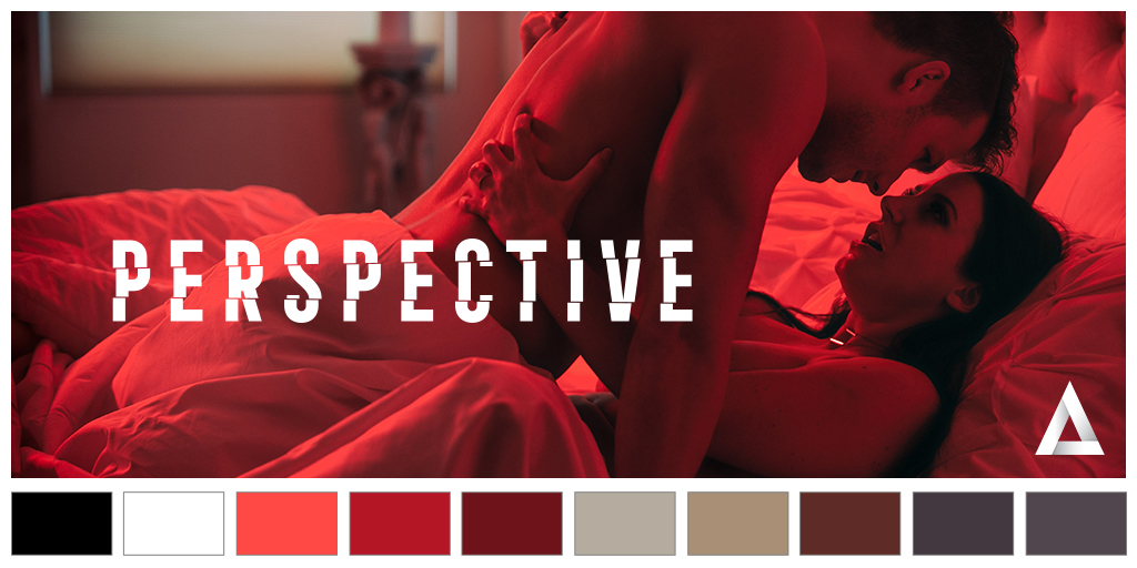
Written and directed by Bree Mills, Perspective is a sexy psychological thriller about a couple in the final days of their marriage. The story has a Rashomon-like structure, being told from the perspectives of several characters.
The cinematography by Matt Holder aims to convey the main theme of the movie: the impact that emotion has on people. As Mills wrote when it came out, “How, no matter how strongly you feel about your position, you’re only ever seeing your side of the story. ⦍…⦎ I’ve had to face the complicated reality of discovering a secret and the power shift that comes when you realize that you know something your partner doesn’t know you know.”
As we can see in these two scenes, the lightning and color calibration (editing and visual effects by Woody All-In) strongly emphasizes emotions with strong primal colors (red, blue). Shadows are used to suggest the secretive nature of the plot and relations between the characters. Gary Pleasant’s music also subtly evokes the glorious day of 1990s erotic thrillers and mysteries cinema (think about Red Shoes Diary, Erotic Confessions or Fatal Attraction).
The film stars the best talents in the adult business : Angela White, Seth Gamble, Codey Steele, Abigail Mac, Alina Lopez, Michael Vegas, Gianna Dior, Isiah Maxwell, and Whitney Wright.
The film won the AVN awards for Best Actor (Seth Gamble), Best Actress (Angela White), and Best Screenplay (Bree Mills). It also won the XBIZ award for Best Actor (Seth Gamble).
Have you watched Perspective? What do you think?
Are there any of our productions you’d like us to cover in the future?
Let us know in the comments below or on Twitter, or Instagram!
See you next month, for another Adult Time In Color!


How does someone send a suggestion for a scene or a possible series that I’d like to see? To whom can I send my suggestions and how do I send them?
You can send a suggestion for a scene or series when we run surveys. We’ll be running a survey this month. Keep an eye out in the members area for the survey banners.
as a photog in the real world, I love it when ANY AT production gets creative with both the color and framing of their shots. their lighting is also above and BEYOND anything I see on any other major competitor sites. it’s what makes for quality porn worth paying for, man.
So my comment below had now been awaiting for (sic) approval for a week. And this is somehow better than our old Forum. What does it take to get a comment approved? Better yet, what does it take to get an issue addressed?
Hi GrandadWW.
I’ve forwarded your comment about these problems to our dev and content teams.
I have not watched Perspective, though I will check it out now that it’s been highlighted and brought to my attention. I think articles like this on your blog are great for members like myself – highlighting things worth highlighting for those who haven’t been a part of the Adult Time journey for years and years. I personally came on board September of 2020, last year, so for me this kind of blog entry is great. Hope to see more like it.
[I also think that a 1 channel/week spotlight blog entry would be very welcome, giving them all their own time in the spotlight, there’s a lot that produce really good content but might not get the exposure they arguably deserve. 1/week would just about cover your channels over the course of a year and it’s 52 blog updates, ready made, waiting to be typed up and posted.]
Topically – I’m all about it. I’ve been vocal in comment sections regarding the de rigueur lighting and set décor over the past interminable amount of years in adult entertainment – All White Everything. White walls, white drapes & curtains, white ceiling, white couch (always a white couch), over bright lights – everything is white, over-lit and washed out. The standard porn set feels clinical, cold.
What you describe in Perspective, and I aim to watch it after this post, sounds like just the opposite! And I love it.
Not just in an erudite Ivory Tower Intellectual manner (which I well understand, as presented here), no, I also just enjoy different sorts of lighting and colors on set. They please my eye so very often.
I like things that are bold, electric, vibrant, fresh, simply ablaze with color. There are only a few adult companies that epitomize this style and I am very much attracted to it (often being kept away due to mouthy male talent, though there’s one other Network I’m subbed to that does this sort of thing fairly often, but not always) and would like to see more of, in your own productions AdultTime. Not only do I like colors like that but I also like deep, rich, dark, glowing with warmth stuff that simply feels “cozy”, like you can just settle right into it and relax. I love both styles and would like to see much more of them, and other lighting experiments (including wardrobe and set décor) across all of your production Adult Time. Especially Girlsway.
When you stated, “…the lightning and color calibration strongly emphasizes emotions with strong primal colors” I can identify with this. As a youngster, growing up, when I was learning the world around me and I thought in my head, envisioned various emotions, I would associate them with certain colors. Roiling red clouds being anger; various shades of green representing sickness, jealousy/envy, or even nature and calmness; black being an end, or death; blue being calmness, peace … all the varying shades varying with the emotion and intensity of it. So in this aspect the use of these primary colors is something I think most anybody watching can “feel”, can get, on a sort of primal level.
Good piece, looking forward to more like it.
Thanks! The next one will be fun too. 😉
I don’t see any way I can create a new thread here. This blog was supposed to be better than our previous Forum but I don’t see how that is true. Continuing a thread that used to be on the old Forum that wasn’t getting any attention, and which contained several pieces of unfinished business that have probably not been attended to, the scene Don’t Make This Weird released on 2021/03/27 contains 2 sequences of damage. The damage looks like somebody dropped a glass of water on the image. The damage occurs at time index 17:19 & lasts for 13 frames, and again at time index 26:59 & lasts for 15 frames. How will you notify us when this damage has been corrected & a new copy of the scene has been uploaded to the site? For that matter, will you ever deal with the issues like this one that were raised on the old Forum but never addressed? By the way, this scene is also marred by the shadow of the camera operator falling on the actresses at a number of places in the scene. You can easily make out the outline of the camera & part of the operator’s silhouette. There’s nothing you can do to correct this in this scene. I just raise the issue in the hopes that the people doing our filming are more careful about such things. This isn’t the first time I’ve raised this issue so with every passing day, I have less & less hope that this will be addressed.
While I’m here, I may as well report another issue that has occurred now for a second time. This seems to be something that occurs late at night on a weekend. The issue is that tonight, the servers are not providing the usual bandwidth that I normally get. Usually, I can download content at about 9 million bytes per second. Tonight, I’ve been seeing speeds under 50,000 bytes per second. Bytes per second. I express it this way so there is no confusion over Bps, KBps, MBps, is b bits or bytes, is K 1,000 or 1,024, and other abbreviations. Tonight’s speed is about what I used to get with a dial-up modem in the bad old days. When this happened a week ago, I tried to get somebody from support into chat. I was given the completely irrelevant suggestions to:
. Use a different browser.
. Download a lower resolution version of the content.
. Check my ethernet cables.
. Wait until later.
You need to teach your support folks that when a customer calls in to report that the servers are not providing the usual download speed, that they not offer these irrelevant and insulting suggestions. The problem is not out here. The problem is at the servers. The support people need to have access to a technical support person whom they can contact so that the tech can do something to the servers to restore their proper bandwidth. The support people on the phones & in chat need to be made aware of this so they don’t anger the customer (me) with their complete lack of recognition that I am reporting a problem AT THEIR END. This is NOT a problem at my end. Most nights, I have no problem with downloads. A 4G download completes in 5 or 6 minutes most nights. But it seems like on weekend nights after midnight, something happens that destroys the bandwidth available from the servers. You need to look into what is happening, and you need to train your phone/chat support people on this subject.
About to have me some adult time. Company
Great segment! Looking forward to more of it!
#HappyPorn